UX Frustration: Boston’s MBTA Public Transportation App

I recently had a poor user experience using the MBTA Transportation app.

I use the app to purchase rides between Salem and North stations, and have my credit card info stored in the app.

I had 7 minutes to purchase a round trip ticket.

First

I chose my trip, and selected my credit card.

After I chose my trip, I selected my credit card, which I’d already linked to my MBTA account.

Second

My email was stored in the app, but not the CVV for the card.

My email was stored in the app, but not the CVV for the card.

Annoying. I started digging through my purse for my wallet, so I could look up the CVV number.

Not very user-friendly for someone hurrying to purchase a ticket before boarding a train.

Third

I didn't have the card tied to this account in my wallet - I only use it for online purchases. I used it that morning, and recalled the digits in the CVV but not their order, so I guessed.

I didn’t have the card tied to this account in my wallet. I only use that particular card for online purchases, so it often stays at home.

I’d used it that morning for an online purchase, and recalled the digits in the CVV, but not their order.

Not having much cash on me, I made my best guess.

Fourth

I seemed to have guessed correctly, as I reached what looked like a final purchase screen. If there had been a problem, I would have expected it to prevent me from reaching a final purchase screen.

I seemed to have guessed correctly, as I reached what looked like a final purchase screen.

If there had been a problem, I would have expected it to prevent me from reaching a final purchase screen.

Apparently I made a good guess.

Fifth

The confirmation screen says TODO on the top, provides a quote number (whatever that is), and a Check Details button.
 

The confirmation screen says TODO on the top, provides a quote number (whatever that is), and a Check Details button.

Not sure what “TODO” means. There’s no guidance on this screen proving any context.

There’s a quote number. Not sure what that’s for, either.

My purchase must have gone through. Weird screen, though.

I clicked the Check Details button, expecting to see a purchase confirmation.

Sixth

When I clicked the Details button, I ended up back on the screen where I input my CVV. Everything is filled out, except the CVV, but there's no indication that I've input the wrong number.

The Check Details button put me back on the screen where I input my CVV.

Everything is still filled out from my purchase, except for the CVV number, but there’s no indication that I’ve input the wrong number.

If there was a problem I would have expected the incorrect data to be highlighted, or to receive an error message alerting me to what I needed to fix. Neither of those things is presented on the screen.

Having the incorrect CVV remain on the screen in a highlighted manner – with the words “wrong CVV” next to it, in the input, would have been most helpful. I could have seen the incorrect number, and known not to use it again on my retries.

Knowing I’d guess at the CVV number, I assume that’s the problem, but without any explanation from the app, I’m not sure this is the issue.

I retried my purchase several times, AFTER I’d boarded the train, using different combinations of the CVV. All failed. None of my attempts provided a proper error message.

UX Trends for 2016

http://uxdesign.cc/ux-trends-2015-2016/
http://uxmag.com/articles/the-top-ux-predictions-for-2016
http://blogs.adobe.com/creativecloud/7-ux-design-trends-to-watch-out-for-in-2016/
http://www.creativebloq.com/infographic/will-these-be-big-ux-trends-2016-121518536
http://designexcellent.com/10-ux-trends-and-predictions-for-2016/
http://review.content-science.com/2016/01/microsofts-ux-design-lead-shares-the-top-ux-trends-for-2016/

Design Trends for 2016

2015 Web design trends
http://designmodo.com/web-design-trends-2016/

http://www.webdesignerdepot.com/2016/01/essential-design-trends-january-2016/

http://www.elegantthemes.com/blog/resources/2016-web-design-trends

http://thenextweb.com/dd/2016/01/01/10-web-design-trends-can-expect-see-2016/

2015 Pantone color of the year
http://www.pantone.com/color-of-the-year-2016

2015 Graphic design trends
http://www.howdesign.com/resources-education/graphic-design-trends-2016/

http://www.designbolts.com/2015/12/12/10-new-trends-of-logo-design-for-2016/

http://trendlist.org/

Structural HTML and CSS as design elements in responsive design

One of the biggest challenges designers face in creating adaptive and responsive web media is ensuring their layouts display admirably on different devices.

The first logical step when designing an adaptive or responsive site is to address the needs of the smallest display first, arranging the content so that the most important bits are visible and readable upon site load in that tiny mobile viewport. The information a site visitor needs to determine if the site is relevant (which makes them interested in reading more of its content) should be front and center, with a call to action, and defined paths to additional information.

So let’s say you’ve done this. You have a sketch or wireframe of your mobile display in hand, and you’re ready to consider the design of the larger displays. If you’re creating an adaptive design, you may have unique device-based HTML layouts.
But if you’re designing a responsive site, your larger device design layouts will be largely similar to your mobile ones, but you’ll probably find yourself modifying your mobile design to make it more interesting on a larger device.

If you’ve ever been asked to produce a site designed by a graphic designer with little working production knowledge of the web, you know that not every mockup envisioned in Photoshop or Illustrator works as a viable website. After you’ve tackled a few sites designed by a print designer, the coding problems you’re going to have become obvious when viewing a Photoshop doc.

That’s because you’re thinking of the design in terms of its structural HTML and CSS code.

Viewed this way, the HTML and CSS of the site are the core elements of the design.

Returning to your original challenge of designing your larger device layouts based on your mobile wireframe – the structural HTML and CSS will determine what layouts are possible, assuming you’re not creating a fixed width site. So how do you know what layout options are viable, based on your mobile sketch?

You could go ahead and work in code, maybe use a pre-packaged grid or hack together a basic non-grid layout, to help you think about how the code needs to be structured. Or, you could modify your mobile sketch to include block-level structural HTML elements, rather than wasting time touching code.

After creating the mobile wireframe for eternal-massage.com in Illustrator, I modified it to include boxes to represent the block-level elements I expected to code. The original is on the left, below; the block-level version is on the right.
sketch_mobilesketch_mobile_blocks
I’d already decided to set up the small site’s 3 pages as a single scrolling page for mobile, and I had an idea in my head to have a large image in the background of the homepage area. Looking at the mobile block-level wireframe gave me plenty of ideas about how the code could be structured, and how I might apply CSS to alter the layout for different device-sized screens.

Armed with this knowledge, I copied my mobile block wireframe into a new Illustrator document and stretched it out to pad-sized proportions, using the mobile layout as the starting point of the pad’s wireframe, with the structural block elements I’d mapped out for mobile already in place. Rinse and repeat for desktop.

Playing around with the layout of all three device wireframes, I realized I’d need to modify my HTML structure to support the subtle display differences I wanted on my larger the devices, including some unique items for each that would conditionally display based on media queries.

The exercise of creating block-level wireframes saved me a great deal of time. When it was time to craft polished mockups with fonts, colors, image and graphics, I already knew how I would code the final site. This clarified my design decisions, and made production faster.

Content architecture for adaptive and responsive design

Q: So how does one begin crafting an adaptive or responsive design?

A: The same way you’d design any website. It all starts with the content.

When your client provides 6,000 words of website content (often broken down by pages), unless he or she is an information architect or usability specialist, chances are, you’ll find yourself suggesting content edits and placement changes.

Because an adaptive or responsive design displays on mobile, its content must fit admirably within a tiny viewport, and be readable. And while you could use a line navicon for navigation, buttons for mobile should be large and easy to strike. If you opt for larger buttons, your remaining screen real-estate for content is reduced. Content that doesn’t fit in the sweet spot, the portion of the mobile screen visible when the website first loads, will need to be scrolled to, by the user, if it’s to be read.

This means making some strategic decisions about what content actually belongs on the site, and where it gets placed – especially on the homepage.

Most people surf the web to get information. They research, and they’re lazy. Upon arriving at a site, they want to know immediately if the site has the information they seek. If they think it does, they’ll stick around to find it. If not, they move on to the next site. As designers, we need to take this behavior into account, and plan for it.

When I first met with my client prior to developing www.eternal-massage.com, we discussed the topic of content creation. He wanted to know what he should write for each page.

I suggested he write as little as possible, forgetting about where the content would be placed within the site, instead concentrating on why customers should engage him rather than his competitor. Days later he sent me a handful of photos and these 336 words :

Welcome to Eternal Massage:

I use established techniques of Swedish, Deep-Tissue and Sports Massage that are combined with various other modalities to form a unique bodywork treatment that will appeal to both the novice and experienced alike. I am innovative and pride myself on my long list of satisfied clients of over 10 years. We are Eternal Massage, where clients will come to expect a therapeutic experience which will support, heal and soothe mind, body and soul. Each body is unique and you will find a customized massage that addresses your specific needs.

My dedicated treatment rooms have been especially designed for comfort and state-of-the-art equipment. Breathe, relax, let go, stretch and surrender the stress, aches and pains of life. My goal is to provide you with the finest, most impactful, professional therapeutic and healing experience.

Eternal Massage is conveniently located with plenty of parking at 10 Colonial Rd. Suite 4 in Salem, MA, off of Jackson Street.

Saul Barragan

Saul Barragan has been practicing therapeutic and healing massage for over 10 years. He is highly skilled in numerous modalities such as deep tissue, shiatsu, reflexology, Swedish, Thai and neuromuscular techniques. He uses light to heavy pressure coupled with range-of-motion techniques for the neck, shoulders, arms and hip flexors. Saul’s highly focused treatment unites the body as a whole, giving the client a sense of connectedness and well-being. In addition to stretching tight muscles, the treatment increases circulation and reduces accumulated stress.

Nurture yourself with a therapeutic massage from Saul for a renewed you today!

Treatments
30min / $40
60min / $75
90min / $90

Packages
$195 — 3 pack of 60 minute sessions ($30 savings)
$285 — 3 pack of 90 minute sessions ($30 savings)
$300 — 5 pack of 60 minute sessions ($75 savings)
$450 — 5 pack of 90 minute sessions ($75 savings)

Packages must be paid in full at the time of purchase, in-office or by phone. Pre-paid sessions will remain on your account until they are used or for seven years, which ever comes first.

Mobile display was my biggest concern. Little content is visible in the tiny viewport, and whatever appears in it on the initial page load, has to hook the site visitor in to find out more. I needed to do some editing.

But what information would immediately let the potential customer know they’d found the right massage therapist for their needs and want to learn more?

  • Name of the business / logo
  • Service offerings unique to customer needs – a solution to their problems, and a way for them to identify with you
  • Location – important, given services are delivered in person
  • Call to action – also important is funneling the client to you. Without a call to action, a site visitor is forced to locate your contact page, to figure out how to reach you. Providing a call to action allows the customer to reach out effortlessly – remember, internet users are lazy. My client was already using an online booking app on a Facebook business page he’d set up, providing me an almost too-perfect call to action.
  • Jump off to additional info about the business – the client’s content contained granular info about his technique, pricing, and background. All that was needed was a way to get the visitor there.

sketch_mobile 
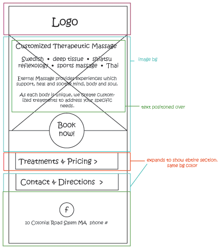
Based on these 5 critical bits of information, I crafted this sketch, selecting bits from my client’s 336 words of provided content.

Upon page load, potential customers see the name of the business, its unique service offerings, a call to action – a link to the online booking system, the business address, and big buttons shuttling the site visitor off to research more content about the business and services.

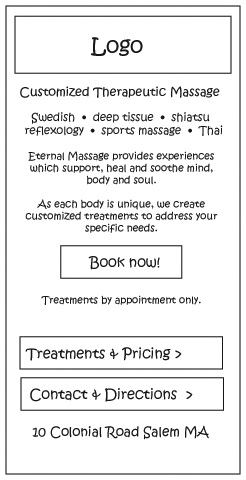
With a limited amount of targeted content in the viewport I decided to structure the site as a single page, to keep the site visitor engaged, by eliminating the need to load different pages, using the big buttons to hide and show the additional pages of content detail. This important content-based decision shaped not only the site’s mobile display, but its presentation on pad/tablet and desktop.

Thinking about content architecture on mobile display as your first step will ensure your site’s content is geared around the site visitor’s needs, and help your client connect with more customers – regardless of what device they use.

Responsive vs Adaptive design considerations

The world of web design has changed.

As users turned to mobile devices for internet access, Web design adapted to meet the needs of a multi-device audience. Designers who once lamented the difficulties of developing pixel-perfect sites for different browsers now also have to contend with display on pads, desktops, and mobile phones. Fluid layouts are now the benchmark of the good web designer. Multi-device performance has replaced pixel-perfection.

To keep current, developers have two choices, if they hope to remain current and create sites for multiple devices: adaptive or responsive design.

Adaptive vs. Responsive Design

Adaptive design uses media queries, codes that funnel the site’s HTML rendering through CSS documents that make the layout adapt to different device display sizes or viewports, based on their specific measurements. These measurements define the “breakpoints” at which the page’s rendering adapts to a different layout. Adaptive designs typically utilize more than one HTML document and.or CSS file to achieve different layouts.

Responsive design often use a single grid-based layout that scales up or down based on media queries to display the site’s content relative the device. Responsive designs typically employ one HTML document that flexes, depending on the size of the viewport or device on which they’re viewed. Pages shrink, grow or rearrange their layouts to fit the device.

Both adaptive and responsive designs are partly or wholly fluid, in that they utilize percentage units to scale typography and layout elements relative to the dimensions of the display on which they’re viewed.

Which is best?

It all depends on the site. Both are viable options.

Responsive sites are harder to build and take longer to execute. It’s easier to make a few layouts geared toward specific devices than it is to limit the site’s design to one layout that works equally well on all devices, and develop that single layout.

For a small site that won’t be upgraded frequently, an adaptive design might be a better option – especially if the long-term plan is to replace it at some point with a larger, responsive site.

A deficit of adaptive design is that future devices might not support the layouts you’ve created. Device displays that fall outside the pixel dimensions you’ve targeted with your media queries might not be a good fit for your layouts. You might need to create additional layouts to support new devices. For this reason, you should expect an adaptive design to require more maintenance than a responsive one. For a larger site, a responsive layout might be a better option, from a maintenance perspective.

A responsive design on the other hand will always scale to fit any device. You’ll never have to worry about how it’ll look on a smaller mobile screen or a larger monitor. And because a responsive design uses a single layout, your small site will load slightly faster than an adaptive site that has the overhead of multiple layouts to download.

Case in Point

I recently designed and developed a small 3-page website, www.eternal-massage.com , using strategies of both adaptive and responsive design. I created 3 layouts: desktop, pad/tablet, and mobile. While the site doesn’t use a grid-system, I did build fluidity into layouts, to allow the columns to flex, for devices that were slightly outside the pixel dimensions I’d targeted for each of my 3 devices. Columns of text flow atop one other on smaller devices, and sit side-by-side on desktop monitors.

The layout is almost identical for both pad/tablet and mobile devices, while the homepage differs on desktop to take advantage of the screen real estate. I decided on this approach as the content for the site was minimal, and the massage therapist was targeting the luxury-item demographic of potential customers, so I wanted to be able to concentrate on the aesthetics of the site, rather than limit myself to a design that would scale to the device.

The client plans to build out the site as the business grows, and at that time I’ll be converting the site’s adaptive design to one that’s truly responsive. Right now, his goal is to build his business by attracting a customer base geared toward luxury-item income.

When his business grows, and his reputation among his desired customers grows, the aesthetics of the site, while still important, can alter to support a less-fixed responsive layout.

Job Functions vs. Titles

I recently came across this interesting post defining the different industry job titles and their functions.

http://www.fastcodesign.com/3032719/ui-ux-who-does-what-a-designers-guide-to-the-tech-industry

As a designer with hands-on front-end programming skills, and as one who has managed and built design teams,  I’ve always felt that hands-on programming experience allows designers to execute better designs.

Understanding what it takes to produce a design (beyond crafting wireframes, composites and  graphic assets) often means that scalability, ease of future release changes, and production efficiency are considerations reflected in the design solution. I’ve worked with designers without this knowledge and have seen them create stunning solutions that unfortunately are difficult-to-implement, and even more cumbersome to maintain as upgradable entities.

So does the design-only team model lead to programmed solutions that require more development hours to produce, maintain, and release?

Looking at the functional descriptions of the roles detailed in the article, I see none explicitly include any hands-on front-end development tasks.  I’ve yet to work in a team environment where front-end development was a separate function performed entirely by a different group.  I know this model exists, though I would truly be disappointed to find myself entirely relegated to development-free tasks.

I also have to wonder: do other designers like myself with front-end development skills feel limited or disappointed in roles where they’re not building at least some piece of their designs?

As I get ready to embark on a search for my next role, I also worry that my next design job will be development-free, and my technical skills will downgrade and suffer as a result. In turn, I may lose the ability to consider production efficiency as I design.

I also know I wouldn’t be happy as front-end developer without design responsibilities. My strength as a designer is my primary trade, and my development tasks and abilities are better suited to creating templates for build-responsible productions teams. Naturally I’m slower at producing code, because I’m concentrating on writing it for efficient and easy production by others, rather than mass-producing a high volume, myself.

So where does someone with my skills fit into the UI/UX world?

Design Trends for 2015

2015 Web design trends
http://designmodo.com/web-design-trends-2015/

http://www.webdesignerdepot.com/2015/01/10-web-design-trends-youll-actually-see-in-2015-and-how-to-survive-them/

http://www.elegantthemes.com/blog/resources/web-design-trends-to-look-out-for-in-2015

http://justcreative.com/2015/01/02/web-design-trends-predictions-2015/

2015 Pantone color of the year
https://www.pantone.com/pages/index.aspx?pg=21163

2015 Graphic design trends
http://www.aiga.org/designer-of-2015-trends/

http://www.designbolts.com/2014/12/27/10-new-trends-of-logo-design-for-2015/

http://www.istockphoto.com/article_view.php?ID=1788

Discontinuation of Microsoft’s SharePoint Public Site

I can’t say I’m the least bit surprised to see Microsoft discontinue this “feature” for new Office 365 customers after March of 2015.

The reason, according to MS’s support article ( http://support.microsoft.com/kb/3027254 ):

“After careful consideration, we concluded that for public websites, Office 365 customers would be better served by third-party providers whose core competency is public websites.”

I agree.

Office 365 SharePoint itself is a powerful and robust tool. After implementing a few custom-branded designs on the platform, I was disappointed to find the Public Website  lacking in features and tie-ins compared to its stronger cousin.

Decent developer documentation was also lacking, and even with my knowledge of SharePoint, creating a small public site design took me far longer than designing and producing a similarly-sized site from scratch.  I’ve been advising clients to avoid SharePoint Public and urging them toward WordPress as an easy-to-use, CMS-based option.

It’ll be interesting to see what 3rd party providers and products Microsoft recommends.


Custom Scrollbars: Aesthetics vs. Usability

As a designer, I struggle sometimes with the fine line between aesthetics and usability. Every time I refresh my portfolio website, I search for that sweet spot: something that looks “wow” but is easy to use and navigate.  Unfortunately, some of the “cooler” designs I’ve come up with, while interesting to look at, have confused folks familiar with “typical” websites.

In my site’s previous incarnation, jQuery animation became the battleground between aesthetics and usability. How much animation is good, and represents my creativity? At one point does a volume of objects in motion confuse the user, and over-shadow the site’s ability to communicate?

After viewing my previous design soon after launch, a friend opined, “it’s fun and all, but every time I click or move the mouse, something moves, and then the page fades, and I’m never sure if I clicked the right thing, or if broke something. I’m afraid to touch it.”

That’s when I realized I’d failed. The site was a jQuery playground: animation for the sake of animation. Coolness had won over usability.

When I began to redesign (again — I hate everything I do within months of launch anyway), I decided to focus the design toward usability, instead of “wow”, with a simple but refined aesthetic The goal of a designer’s portfolio site is to show off the work. Yes, the portfolio site itself becomes another work sample, but really its primary goal is to communicate the body of work, first and foremost.

My internal usability vs coolness battle this time became all about the scrollbars, which I wanted to match the site.

The problem is that Firefox STILL doesn’t support CSS-only customized scrollbars.

I considered rolling my own in JavaScript or jQuery, or downloading someone else’s scripted solution. But after making seeing the results of some very superficial color-only CSS tweaks I made for IE, Chrome and Safari, I wondered: is it really worth utilizing a custom scrollbar script JUST for Firefox users?

The style of the site’s design revolves around simple blocks of solid colors, dictating a similar scrollbar style.  In customizing IE, Chrome and Safari, I didn’t see a need to do anything too unique that might distract from the user’s attention on the content. So I decided to lightly style them with CSS color values only, leaving their square-edged default size and shapes intact.

IE, Chrome and Safari look great. And from a usability perspective, the three browser’s toolbars look very similar to their default counterparts, which should be easy on visitors.

As far as Firefox: its users are familiar with the look of its scrollbars, and they function just fine. That’s a plus, when thinking about usability. The issue is more the color.

Adding scripts just to change their default appearance would also add to my site’s script overhead, which is already high as it utilizes jQuery. Additionally, scripts that offer browser-specific work-arounds are prone to break when new browser versions are released. And if (when) I redesign the site again, I’ll have to strip it out later.

My site’s colors include a few shades of gray, so the default Firefox scrollbars don’t appear strikingly out-of-place with the rest of the design. Which is a good thing.

The question is, can I live with them?