One of the biggest challenges designers face in creating adaptive and responsive web media is ensuring their layouts display admirably on different devices.
The first logical step when designing an adaptive or responsive site is to address the needs of the smallest display first, arranging the content so that the most important bits are visible and readable upon site load in that tiny mobile viewport. The information a site visitor needs to determine if the site is relevant (which makes them interested in reading more of its content) should be front and center, with a call to action, and defined paths to additional information.
So let’s say you’ve done this. You have a sketch or wireframe of your mobile display in hand, and you’re ready to consider the design of the larger displays. If you’re creating an adaptive design, you may have unique device-based HTML layouts.
But if you’re designing a responsive site, your larger device design layouts will be largely similar to your mobile ones, but you’ll probably find yourself modifying your mobile design to make it more interesting on a larger device.
If you’ve ever been asked to produce a site designed by a graphic designer with little working production knowledge of the web, you know that not every mockup envisioned in Photoshop or Illustrator works as a viable website. After you’ve tackled a few sites designed by a print designer, the coding problems you’re going to have become obvious when viewing a Photoshop doc.
That’s because you’re thinking of the design in terms of its structural HTML and CSS code.
Viewed this way, the HTML and CSS of the site are the core elements of the design.
Returning to your original challenge of designing your larger device layouts based on your mobile wireframe – the structural HTML and CSS will determine what layouts are possible, assuming you’re not creating a fixed width site. So how do you know what layout options are viable, based on your mobile sketch?
You could go ahead and work in code, maybe use a pre-packaged grid or hack together a basic non-grid layout, to help you think about how the code needs to be structured. Or, you could modify your mobile sketch to include block-level structural HTML elements, rather than wasting time touching code.
After creating the mobile wireframe for eternal-massage.com in Illustrator, I modified it to include boxes to represent the block-level elements I expected to code. The original is on the left, below; the block-level version is on the right.

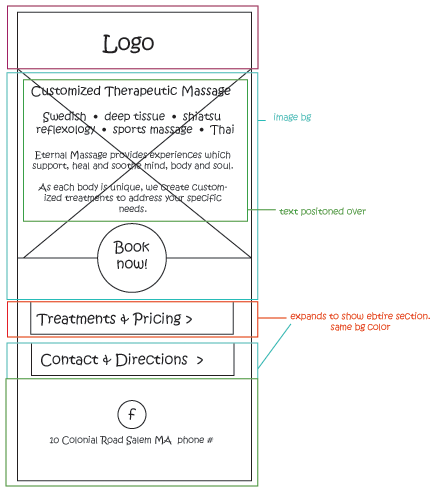
I’d already decided to set up the small site’s 3 pages as a single scrolling page for mobile, and I had an idea in my head to have a large image in the background of the homepage area. Looking at the mobile block-level wireframe gave me plenty of ideas about how the code could be structured, and how I might apply CSS to alter the layout for different device-sized screens.
Armed with this knowledge, I copied my mobile block wireframe into a new Illustrator document and stretched it out to pad-sized proportions, using the mobile layout as the starting point of the pad’s wireframe, with the structural block elements I’d mapped out for mobile already in place. Rinse and repeat for desktop.
Playing around with the layout of all three device wireframes, I realized I’d need to modify my HTML structure to support the subtle display differences I wanted on my larger the devices, including some unique items for each that would conditionally display based on media queries.
The exercise of creating block-level wireframes saved me a great deal of time. When it was time to craft polished mockups with fonts, colors, image and graphics, I already knew how I would code the final site. This clarified my design decisions, and made production faster.